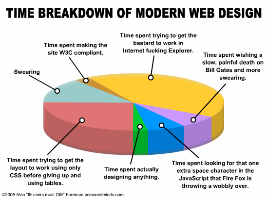
Extremely useful rule-of-thumb pie-chart breakdown of web design time spend. I have two nits to pick:
- I think they’ve seriously underestimated the proportion that should be yellow.
- The best gag of all, of course, is that ‘content’ isn’t even on the pie chart. Don’t think we haven’t noticed.
Gag? Wait, you mean that’s not meant to be taken seriously…?
Ah, I can see why you’d think more space needs to be apportioned to yellow.
Obviously they didn’t have room to fit the “Time spent trying to get the $%^&#@ thing to work in IE on the Mac”. That’s occupying whole ‘nother pie chart all to itself…
My nitpick is that ‘W3C compliant’ means bugger all to a high proportion of web coders.